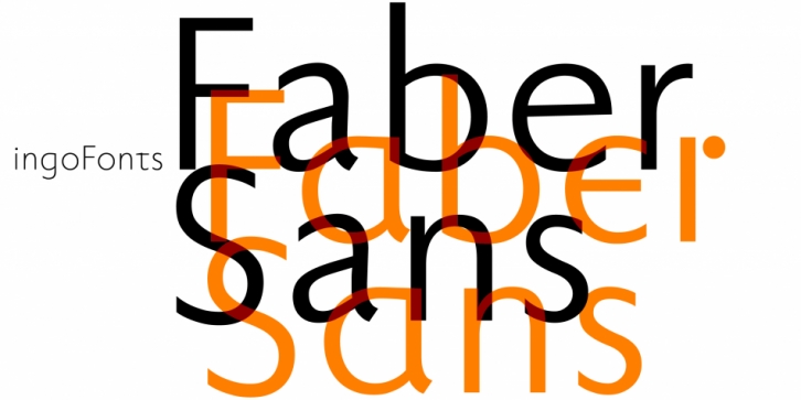

Two fonts in one: a classic-modern sans serif appearing in two forms – â€standard“ and a â€stylistic alternate“ with uncial script-orientated characters which give the font a completely different â€look.“
A uniqueness of Faber Sans is that it is actually composed of two fonts. The »basic typeface« is a sans serif in the classic-modern style of type creations of the early 20th century.
The Roman Capitalis provided the model for the classically proportioned capital letters and the harmonic shapes of the humanistic minuscule for the lower case characters.
It is reader-friendly under adverse typographic conditions on the monitor.
A â€second“ typeface with its own personal character resulted as stylistic alternates were designed for the letters a e f g l t u in accordance with the uncial scripts of the late antiquity or rather the early Middle Ages. And the r is given a playful point in the stylistic alternates. The stylistic alternate can be accessed via the OpenType-Functions »Discretionary Ligatures« or also »Stylistic Alternates« (and of course the glyph panel).
Unlike classic sans serifs, Faber Sans includes a â€true“ italic. The italic characters are not simply just slanted variations of the upright, but the characters originated out of handwriting styles; they are rounder and the stroke flow is more fluent than on the upright letters.
Font Family: