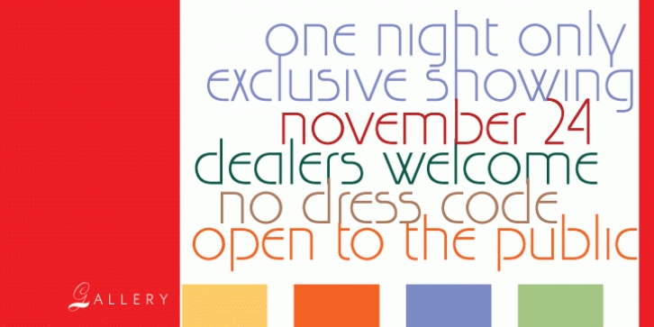

Browsing through film archives at an independent film and audio production company in Winnipeg, Patrick Griffin spotted some unique set letters on a sign and a lawn chair in a 1980s B-movie entitled “Canada: Another Government Movie”.
The film itself was considered very avant-garde for about three days, long enough for it to earn a Blizzard nomination, then it sank into that dark hole where all wannabe film-noirs end up.
The letters on that sign and chair would still be in the land of the forgotten, were it not for what Patrick calls his “font attackâ€, which is a series of curious moments where he would try to reconstruct a full font from a few visible characters. He tends to cut the air with his hands and squeezes his face into a lemon-suction expression while he is in such a state, but that is neither here no there.
In this case, about 95% of the way through reconstructing this Gallery alphabet from 14 letters, Patrick ran across an old film-type pamphlet that shows some of the missing characters. The pamphlet credits the original design to H. Baumgart for the Haas foundry in 1970.
But it was too late to change the current design of Gallery, so the final work ended up being a mix of Baumgart’s and Griffin’s imaginations. Gallery is an obvious art-deco attempt at humanising and remodernising the display aspects of the famous geometric shapes of Paul Renner’s Futura.
While Futura has a bland, masculine, almost cold appearance when used for display, Gallery has an inviting unisex kind of modern art appeal. While Futura relies on a strict set of geometrical shapes to build its legible forms, Gallery uses a different set to harmonise the letters, though geometry remains the design’s driving force.
For a quick instance, Gallery tries to fix the very minimal differential between Futura’s a and o by introducing a disconnection in the a and building it on a semi-circle instead of a complete one. Gallery comes in two weights, regular and bold, and contains some very interesting letters, such as the very minimal one-stroke Q (even more minimal than Futura’s!), the “leggy†R, K and k, the intriguing raised-crossbar e, the distinct majuscule-like y, and the majority of the numerals.
A few alternates are provided within the fonts. If you want art deco with a true geometric spin, Gallery is your type. It is very useful for anything art-related or modern in nature (just type iPod in it and see!).
Patrick claims that it can be used to add gloss to cheap paper, but we think he’s just employing a figure of speech.
Font Family: