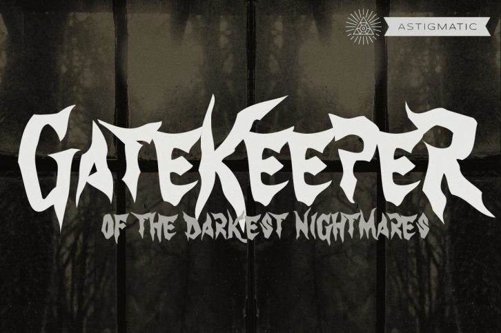

GateKeeper was inspired by old horror movies, heavy metal bands, and the various poster typography that went with some of them. Its haunting loose and pointy lettering style embodies the darker side with a creepy, on-edge feeling. GateKeepers mix of large and small capitals allow for easy interchangeability in events of typing double letters, lending itself to an offbeat scary appeal. This typeface is best suited for the niche it was designed for: dark matter.
See the 5th poster graphic for a preview of the extensive character set of GateKeeper
