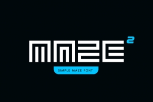
You may have guessed it already — GeoCon is a geometric, condensed font. It is made specifically for sleek titles on the web, and being a light weight, it’s best at 16pt and larger. But boy, once you see these letters up close and personal, you’ll fall in love with their elegant curvature.
• Behind the Font We wanted to develop a sexy, modern font crafted specifically for web usage. The majority of the condensed glyphs are designed at a strict 1:2 ratio giving them a very sturdy and solid geometric feel. Notable exceptions to this ratio are the "half" letters f, j, r, and t coming in at a 0.5:2 ratio and wider letters, M, and W, at 1.5:2.
We want to be transparent with the intended application of our fonts. We believe that fonts should be designed for specific usages at predetermined sizes rather than forced to be used in ways (and at sizes) that it was not intended. This is why we are very open in sharing that GeoCon Light is intended to be used for titles and headers with a minimum recommended size of 16pt. When used at or above that threshold, you will be able to utilize the font to it's full intended potential and have it display with maximum effectiveness.
Lines, angles and curves are based on precise mathematical measurements. The result is a clean font that is very readable at moderate sizes, and literally shows off at larger sizes. We're very pleased to release it to the community.