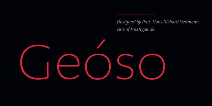

Geóso is a humanist sans serif with a geometric feel. It brings italics which stand out and true small caps. The typeface is optimized for readability in small sizes – and elegance in large ones.
With Geóso, we followed a specific concept for spacing based on studies of aesthetic perception and supported by 30 years of experience by Prof. Hans R. Heitmann.
Font Family: