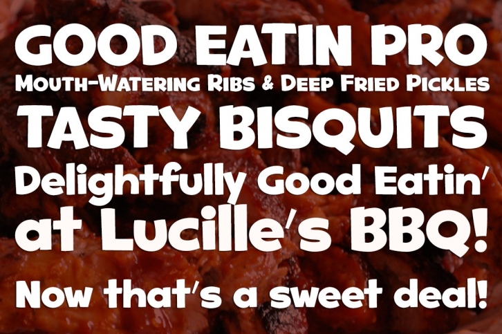

A heavy weight - softened sans serif that is not only friendly, but easy on the eyes.
Good Eatin was inspired by the title screen from the 1942 Warner Bros. cartoon titled, “Dog Tiredâ€. The original all capitals setting had a charming & quiet nature to it, which became even more pronounced when drawn out to include a lowercase set.
Later expanded upon to include a Small Caps set, Good Eatin Pro achieves a wider, even more electric appeal. Loaded with personality, Good Eatin Pro is joyful and stands out without being an eyesore, and while being based on vintage lettering it has a contemporary feel.
