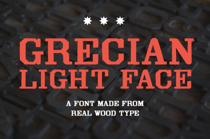

Grecian typefaces typically feel towering and rough-hewn, and are also quite frequently condensed. However, this Grecian is blessed with a wider stance, which might explain its friendlier tone. Yes Grecian Light Face may be old and rugged, but it also has the time to sit down and chat a while.Â
Grecian Light Face was first shown as wood type under the name Light Face Grecian by David Knox & Co. in 1858. Knox appears to be the only manufacturer of this particular Grecian design.
The font includes two weights: regular and distressed. The regular weight is a clean, precise redraw which captures the contours of the original wood type. The distressed weight is a rendering of the textures of the letterpress proof itself, warts and all. The distressed weight features alternate characters with extra dings and blemishes, set as the lowercase keyboard characters.


WTR Grecian Light Face was drawn from 8-line (96 point) wood type. It is a display face, and is best used at larger sizes.
Because wood type was created for headlines, fonts of wood type rarely have extensive character palettes. The characters pictured above are the historically accurate glyphs represented in this font.
