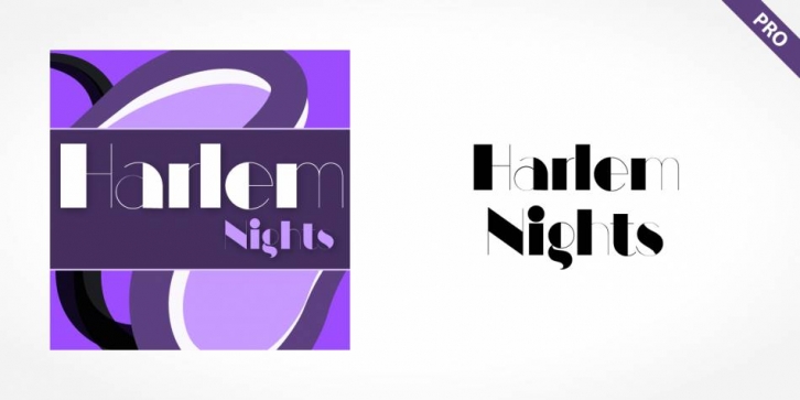

Harlem Nights has an emphasis on the thick-thin contrast. The heavy vertical strokes stand opposite the finest of lines and the thick columns dominate the overall look. The basic forms are strictly constructed, as are those of Morris F. Benton’s Broadway of 1925, to which many parallels can be found. Manhattan is best used for applications that will not be placed too far from the viewer, as at too great a distance the fine lines can no longer be seen. It should be used exclusively for headlines in medium-point sizes.
Font Family: Harlem Nights Pro Regular