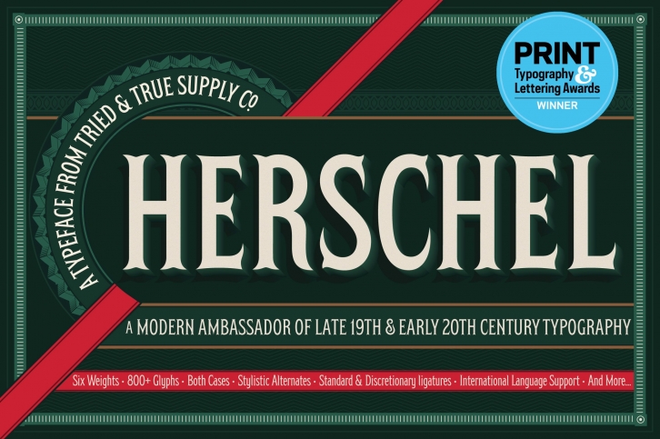

Herschel ventures into the elaborate world of late 19th-century typography to bring its winsome charm and compelling aesthetics into modernity. Staying true to the spirit of its historical era of inspiration, Herschel was designed with extreme attention to detail. Although its aesthetic roots are firmly planted in the treasury of Gilded Age typography, it has been technically constructed to withstand all the rigorous demands that modern technology places on type today.
Herschel’s nostalgic, flared, and gently bifurcated serifs shine brightest when employed as display type, but are suited well for any application where inimitable character is needed.
Named after designer Brian Brubaker’s maternal grandfather, a retired dairy farmer of more than 60 years, Herschel is available in six delectable weights: Skim, One Percent, Two Percent, Whole, Creamline, and Butter.
Features overview:
