CarlMarx
This typeface is based on lettering by Carl Marx (1911–1991), designed during his first semester at the Bauhaus in Joost Schmidt’s class, in 1932. Although the letter proportions are based on Schmidt’s teachings, the forms are not constructed from compass and ruler, but drawn with brush and marker, lending the words a warm and lively touch. Hidetaka Yamasaki redrew the letters from scratch and added all missing characters for today’s needs. A set of hanging figures, alternates for some critical letterforms (such as f, r, and t) as well as several ligatures make CarlMarx especially suitable for use in body text. As suggested by Marx, Yamasaki captured two weights from the original drawing and perfectly adjusted light and bold to highlight words and create hierarchy in headlines – without losing or adding space. True to the original, Yamasaki captured the wobbly contour in CarlMarx, preserving warmth in the condensed geometric style of the early 1930s.
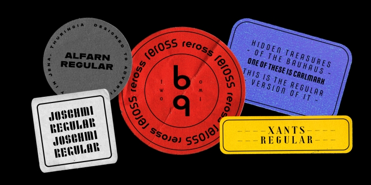
Joschmi
Joost Schmidt’s (1893–1948) name is undoubtedly connected with monolinear condensed letters of geometric appearance – his unfinished draft of a stencil alphabet, constructed on grid paper in 1930, is much lesser known. These modular shapes simply consist of half circles, quarter circles and square strokes with half-round terminals. From just six original letterforms (a, b, c, d, e, g), Flavia Zimbardi completed Schmidt’s draft and extended it to a full character set for contemporary use, adding upper case letters and different figure sets including old-style. Joschmi overcomes legibility issues usually associated with this stencil style, with special attention to the design of white space. Zimbardi lends the face even more character by carefully adding round terminals in subtle spots of the alphabet, accessible through stylistic sets.
Xants
In 1932, Xanti Schawinsky (1904–1979) designed an alphabet that combines two styles: a neo-classic stroke contrast paired with characteristics of stencil lettering. This mix is a child of its time and seems to reflect the Swiss and Italian biography of Schawinski. Luca Pellegrini took on the modern look and re-drew the letterforms, interrupted by subtle spaces where thick and thin strokes meet. Although Schawinsky had already designed a complete alphabet and figures in the early 1930s, Pellegrini took the character set to another level, adding currency signs, mathematical symbols and all kinds of punctuation – anything needed to set more than just headlines. Xants is a blend of Swiss elegance and exclusiveness with Italian charm and imperfection, a combination that never gets old.
Reross
Of all student work produced in Joost Schmidt’s Bauhaus classes, Reinhold Rossig’s (1903–1979) alphabet designs are perhaps closest to his master’s teachings: monolinear, geometric lettering, constructed on grids using compass and ruler. Drafts by Rossig, dated 1929, also demonstrate explorations of letterform width and x-height. Almost ninety years later, Elia Preuss carefully preserves Rossig’s letters and considerations in a proper typeface, by overcoming most of the optical mistakes captured in true geometric letterforms. To carry Rossig’s design further away from Schmidt’s influence, Preuss also lent more characteristic letters found on poster designs by fellow Bauhaus student Hermann Werner Kubsch. Reross is a true Bauhaus-influenced geometric sans, equipped with different historic influences and contemporary features.
Alfarn
Alfarn is based on capital letters that Bauhaus student Alfred Arndt (1898–1976) drew for a poster in 1923, designed to advertise a bakery in Jena, Thuringia. The poster is an example for what we call today “Bauhaus featuresâ€: yellow circle, red square, black bars and an indication of geometric lettering that became so popular in the following years. Céline Hurka carefully analysed Arndt’s lettering and derived two weights in different widths: wide and condensed. She took on the characteristic bars and transformed them into an underlined weight of its own. Hurka also drew perfectly balanced small caps, which make up for a missing lower case. Alfarn captures the spirit of 1920s Bauhaus-influenced posters – a timeless style quite suitable for contemporary designs.
The Adobe Originals program started in 1989 as an in-house type foundry at Adobe, brought together to create original typefaces of exemplary design quality, technical fidelity, and aesthetic longevity.
Today the Type team’s mission is to make sophisticated and even experimental typefaces that explore the possibilities of design and technology. Typefaces released as Adobe Originals are the result of years of work and study, regarded as industry standards for the ambition and quality of their development.
Supported languages: German, Spanish, Dutch, English, Polish, Russian, French, Czech, Swedish, Portuguese, Catalan, Italian, Slovenian, Maltese, Arabic, Devanagari, Greek, Gujarati, Gurmukhi, Hebrew, Chinese (hk), Japanese, Korean, Tamil, Chinese (Traditional), Chinese (Simplified), Turkish, Hungarian, Vietnamese, Bengali, Kannada, Cherokee, Thai, Armenian, Belarusian, Danish, Macedonian, Ukrainian, Norwegian, Serbian, Telugu, Malayalam, IPA, Latvian, Chinese Pinyin, Finnish, Filipino, Malay, Croatian, Kazakh, Romanian, Persian, Indonesian, Slovak, Hindi
File Size: 7.64 MB
Release date: June 7, 2018
You can use this font for:
- Design projects: create images or vector artwork, including logos
- Website publishing: create a Web Project to add any font from our service to your website
- PDFs: embed fonts in PDFs for viewing and printing
- Video and broadcast: use fonts to create in-house or commercial video content and more
- The fonts are designed to work on MacOS (Apple) and Windows (Microsoft)


