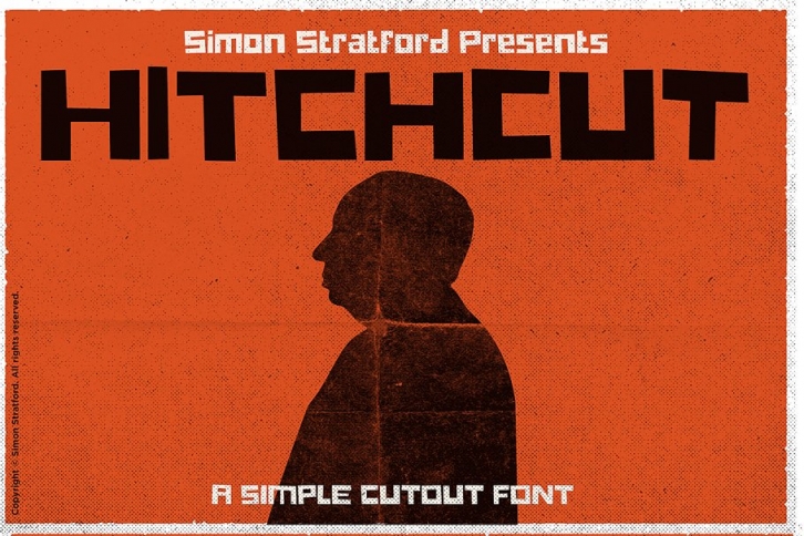

This is Hichcut—a big, bold display font, it’s a play on Hitchcock and cut out (pretty obvious huh!).
It’s wholly inspired by the movie poster vertigo, Saul Bass, and Alfred Hitchcock - it’s a homage more than a slavish copy.
It's retro but modern at the same time.
Childlike but not childish
For Hitchcut, I wanted to have that childlike, playful look and feel. It’s letter shapes are simple and even border on crude.
Straight lines for everything, like it’s been cut out with scissors. This makes it very legible at any size, but it looks better at large point sizes.
Font Usage
Hitchcut is a bold display type, so you can use it for headlines, cards, invites, logotypes, magazines and, of course, movie posters. It's ultra bold style should lend itself to any kind of messaging, use it in all caps or in sentence case.
Included Characters
Font includes:
Contextual alternatives
It also features contextual alternatives for each of the 26 letters of the alphabet, it total it has 3 versions of each. You just need to turn them on and type, the letters will alternate between the 3 choices automatically.
Learn more about contextual alternatives—http://bit.ly/2Jc3w5g
Font Format
The download includes .otf and .ttf.
If you have any questions just ask.
Check out my other fonts—http://bit.ly/1SqAL3l
