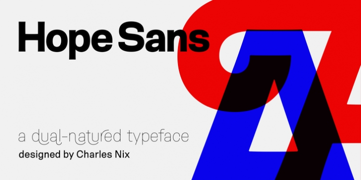

Hope Sans has been selected by the judges of the 22nd Annual TDC Typeface Design Competition to receive the Certificate of Typographic Excellence.
The middle weights of the family are easy on the eyes and shine at smaller sizes and in blocks of text copy. Their friendly vibe also translates well to web and interactive design projects. Spacing is open, counters are large and Hope Sans' range of six weights can provide just the right design for virtually any need. Headlines, subheads, banners and navigational links are naturals for its lightest and boldest weights – either with, or without, the swash letters.
"Hope Sans is a paint box," says its designer, Charles Nix. "In its basic form, it's a sturdy grotesque, capable of setting text in a cool and relaxed way. But a bit of accenting with the alternate forms easily creates an entirely different mood and meaning. And for those that are willing to really mix with it, the variety of alternate characters can build truly unique typographic statements."
Font Family:
· Hope Sans Ultra Light
· Hope Sans Ultra Light Italic
· Hope Sans Thin
· Hope Sans Thin Italic
· Hope Sans Light
· Hope Sans Light Italic
· Hope Sans Regular
· Hope Sans Italic
· Hope Sans Semibold
· Hope Sans Semibold Italic
· Hope Sans Bold
· Hope Sans Bold Italic
File Size: 21.93 MB
