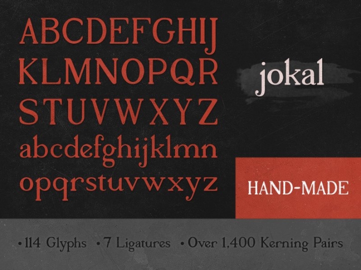

The goal was to create a font that felt like it was hand made and evoked a very personal, human feel. I wanted to saturate every letter of Jokal with a unique character. To accomplish this, every letter started with a pencil sketch on paper and a little bit of imagination.
Once the drafts were complete, letter sketches were brought into Illustrator. While guides and a grid were used to promote consistency throughout the font, the irregularities of the sketches were intentionally kept to preveserve unique traits of Jokal that were imparted by the pencil.
â–º Feel free to a follow along on twitter for lettering and typography goodness: http://twitter.com/seanwes
