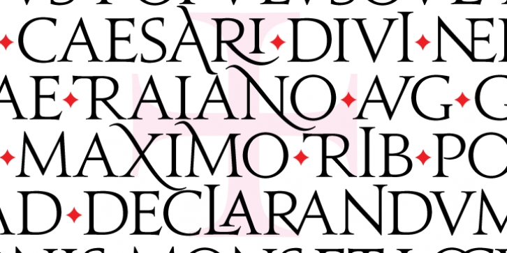

One of the constants in all the hammered history of Roman times is the alphabet used to caption the clipart or tell the stories. That Roman/Latin alphabet, which was a direct spawn of the Greek alphabet, just happens to be the same one the majority of the world still uses today. Records showing what the letters of that alphabet looked like during Roman times seem quite consistent in depicting the overall forms, but vary wildly when it comes to the slight variations introduced by whoever drew the forms. For a random example, sometimes the M had straight legs and two serifs up top, and at other times it had splayed legs and pointy, serifless tops. Ditto the N. And sometimes when the rock slab's length was misjudged by the guy with the hammer, he sneakily blended two or more letters together, or enveloped one letter within another. Those guys had to do such things to save space. It was either trick it out like that or go out again and risk a sunstroke while trying to find another smooth slab (or steal someone's roof). It was just their bloody luck that their leaders wouldn't settle for simple minimalist stuff like Stonehenge.
Anyhow, those Roman letter forms came to be later known as capitals (not to be confused with large sums of money or cities where government building are a-plenty). And the space-saving, letter-jamming tricks came to be later known as ligatures (not to be confused with surgical procedure or sadomasochistic gear).
Lo! We're getting carried away with this stuff. Here's the font's real blurb:
Jupiter is a take on the Roman alphabet the way it looked in Roman times. It is also influenced by many different historical interpretations of the Roman alphabet, most notably the work of Friedrich Poppl, whose rough Nero typeface was a very beautiful expression, though a bit too calligraphic in concept.
Jupiter comes in all popular font formats for both Mac and PC, and supports more than 40 Latin-based languages, as well as Greek. The True Type versions include a font of alternates and a font of ligatures, both filled to the brims with interesting variations on the main character set. Jupiter Pro, the OpenType version, is a single font tied together with programmed features, and is best used within software programs that support advanced typography, like Adobe InDesign CS+, Adobe Illustrator CS+, and QuarkXpress 7+.
Font Family:
· Jupiter
· Jupiter Small Caps
· Jupiter Alts
· Jupiter Ligatures
· Jupiter Bold
· Jupiter Bold Small Caps
· Jupiter Bold Alts
· Jupiter Bold Ligatures
· Jupiter Condensed
· Jupiter Condensed SC
· Jupiter Condensed Alts
· Jupiter Condensed Ligatures
File Size: 18.76 MB
