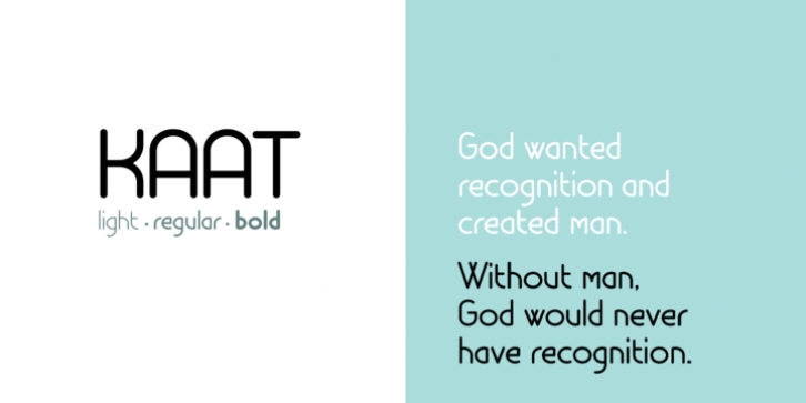
Kaat was designed by Chris Nuijen and published by ChrisNuijen.com. Kaat contains 3 styles and family package options.
'Kaat' is a new type (2013). It was designed by Chris Nuijen and named after his daughter Kaat. It represents the period in which everyone has their face behind the latest mobile phone screen or interactive games console. 'Kaat'is slick, modern and progressive, to reflect our busy immediate life style, whilst providing the essentials in a period where people can be judged on television.
Kaat is here to stay and to evolve. Everyone wants to try to be that little bit different, but essentially we are all the same, with the same inherent needs, just like babies or children. We need to be fed, watered, nurtured and loved, the only difference is in today's world you can do all that from behind a screen. 'Kaat' bridges that gap, transcending the basic needs of type, with the sophistication and fast paced sharpness of today, everyone wants to be different but we all stay the same, this is a reflection in the thickness and shape of each glyph.
The font represents how we are molded and cast differently in yet we still stay the same, because we need the repetition!
Everything needs to be done quicker, simpler and cheaper. We eat we sleep we communicate.
Font Family:
· Kaat Light
· Kaat
· Kaat Bold
File Size: 4.18 MB
Tags: grotesque, repetition,
round,
rounded, sans serif
Release date: November 26, 2013
You can use this font for:
- Design projects: create images or vector artwork, including logos
- Website publishing: create a Web Project to add any font from our service to your website
- PDFs: embed fonts in PDFs for viewing and printing
- Video and broadcast: use fonts to create in-house or commercial video content and more
- The fonts are designed to work on MacOS (Apple) and Windows (Microsoft)
Preview:

