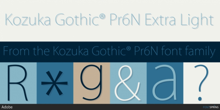

The Kozuka Gothic typeface family, composed of six different weights to cover various uses ranging from body text composition to headlines, have now been completed as OpenType fonts.
Kozuka Gothic provides a clear image common to Kozuka Mincho, but also gives the visual strength needed for a Gothic typeface.
Kozuka Gothic is Adobe’s second original Japanese typeface family following Kozuka Mincho. With the systematic design methods developed for Kozuka Mincho, we have again succeeded in adding to this new Gothic typeface visual strength and clarity, as well as stylistic characteristics common to those of Kozuka Mincho.
The Kozuka Gothic family is composed of six weights in total: EL (Extra Light) which is very light, L (Light), R (Regular), and M (Medium) that cover purposes from body text to display lines for sub-headings, and the heavier B (Bold) and H (Heavy) which are effective for display lines set in larger type sizes. Kozuka Gothic has systematically designed glyph shapes with good design consistency, and fine printability. Retaining the clear and modern feeling of Kozuka Mincho, Kozuka Gothic has the visual strength required for a Gothic typeface.
Masahiko Kozuka, Advisor, who has been involved with many text typeface design projects, supervised, and lead the typeface design project of Kozuka Mincho, and Adobe’s Japanese type design team produced the typeface. Kozuka Gothic, whose style is based on traditional Japanese sans-serif design, was created with Adobe’s new and original design methods developed for making digital typefaces suitable for today’s uses. As a useful typeface family paired with Kozuka Mincho, Kozuka Gothic will widen the user’s creative typographic range.
Font Family: