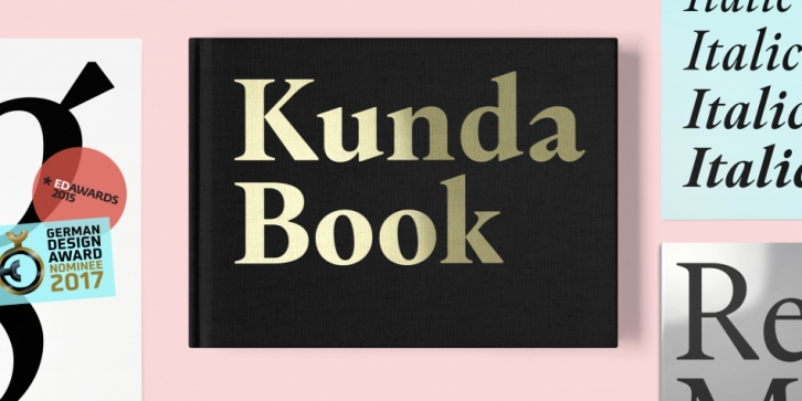

Meet a post-Renaissance serif type with very hedonist attitude – controversial details are discretely included. With low medium height, robust serifs and high contrast, Kunda is a distinctive choice for your glossy editorial challenge.
Kunda is a mix of historically inspired drawing and fashionista heresies. Main influences include such classics as Garamond and Janon, but here comes the twist: calligraphy turns unexpectedly into tough contour lines and serif endings become sharp as a thousand blades. Next: scenes of very dynamic and unexpected stroke crossings. Exposed outstrokes. Then the story ends with strong shadowing and specially drawn Italics. It all comes in six styles with expert features such as ligatures, old-style figures and stylistic sets.
Font Family: