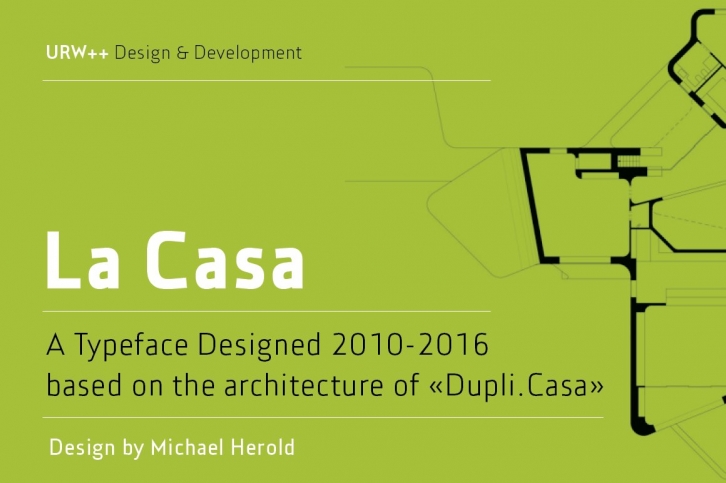

Fontdesign meets architecture – the unique and architectural design of the urban villa “Dupli.Casa†by the architect J.Mayer.H triggered the inspiration for the typeface “La Casaâ€. Inclinations and curvatures mirror the linear, modern impression of the architecture. The overall impression of the sans serif accounts for the great readability, even in lower point sizes – perfect for the design of books and magazines. The fresh and modern appearance of the font is particularly suitable for corporate designs of enterprises. The seven font weights support more than 100 languages and the Cyrillic characters ensure a versatile and international use. The low contrast, the reduction of the corner points and the clear nature of the font make “La Casa†perfectly applicable as a webfont.
Font design by Michael Herold
