
A brief review of my career would read as follows: graphic designer graduated from Buenos Aires University, a 10-year professorship in Typography in the same institution, an illustrator in the making.
For almost 15 years now my work has focused on the design of editorial pieces, predominantly books and CD sleeves. Typography proper has always been central to my research projects.
All my obsessions eventually embodied as much the search for a perfect, spotless text as for a daring and provoking one. In my view, 'how-to-say-something' ranks highest amongst a graphic designer's responsibilities.
It was in this vein that I called in the written word to illustrate, to draw, to narrate. Why not reverse the saying and proclaim that "a word is worth a thousand images"? If so, one single word could trigger endless meanings, associations, ideas, and memories in every reader's mind. Language, we know, has a strong power and is a living expression of a culture.
In my illustrations, letters and drawings reunite in one synergy said and unsaid, the finiteness of the message and the freedom of the free reading.
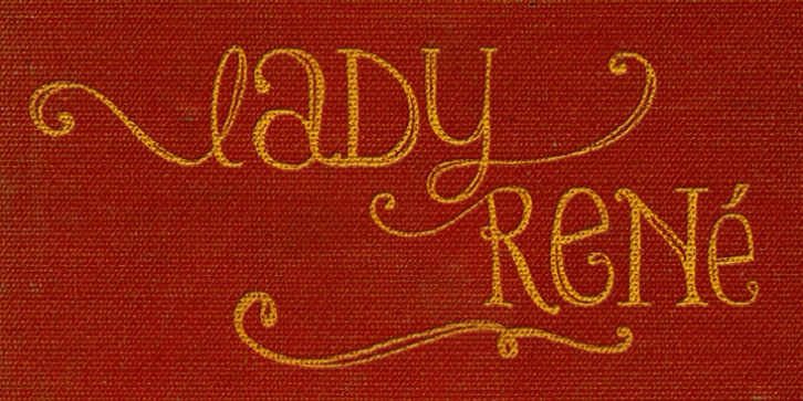
And this is how and when, Lady René, my first born type font sees the light of day conceived out of a love of illustration and a reverence for the written word, recalling the whimsicality of the handmade drawing and reflecting its sensitive, warmth and spontaneity.
Enabled by the characteristics of Open Type and the hard, outstanding work of designer Ale Paul, Lady René succeeds in composing texts in a simple, organic way by means of its contextual and stylistic alternates, swash characters, ligatures and connecting words.
A bundle of decorative miscellanea completes the set of signs, enabling the user considerable freedom to create new typographic landscapes.
Lady René is then prepared, very much like a character in a short story, to come to life in the reader's mind. I expect you will enjoy her as much as I did creating her.
Laura Varsky
Font Family: Lady Rene
File Size: 4.49 MB
