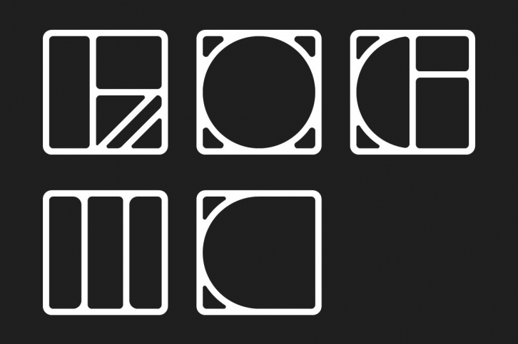

"Logic" makes sense to me for a name to best describe this display typeface – at least the process of how it was developed and challenged. We were working on a project for a new Fashion Brand in the Lower East Side and these shapes kept showing up in our sketching and were very much a reaction to the look book we were building for our client. As usually happens with Almanac we wrapped that project and started to figure out what these shapes were – logic.
The central idea / challenge was how to work within the rigid constraint of the format (across the entire character set). Would or could this force the compositions of each character to try (attempt) to perform a bit of jazz in a small box and still be recognizable as a character. The goal was to try to strip the form down the bare essentials and also create tension or something interesting at the same time.
