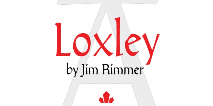

Drawn shortly before Jim Rimmer’s passing in 2010, Loxley was designed to be used in a fine press edition of the folklore story of Robin Hood. It was named after the cited birthplace of the story’s classic hero.
Loxley’s shapes were inspired the same early Roman faces (such as Subiaco from the late 1400s) that influenced Frederick Goudy’s Aries, Franciscan and Goudry Thirty types. It exhibits the preculiarities of Jim’s left-handed calligraphy, as well as his outside-the-box thinking with exit strokes and serif variations.
Loxley was remastered for the latest technologies in 2013. Now it comes with a character set of over 450 glyphs, including plenty of stylistic alternates, a full compliment of f-ligatures, a Th-ligature, basic fractions, ordinals, a long s for historic setting, comprehensive class-based kerning, and extended Latin language support.
20% of this font’s revenues will be donated to the Canada Type Scholarship Fund, supporting higher typography education in Canada.
Font Family: Loxley Regular