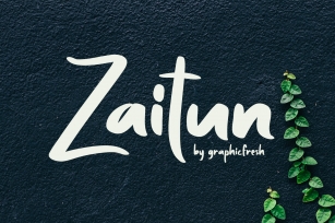
Deepdene is a classic Frederic Goudy design, named after his modest estate in Marlboro, New York. It was originally designed in 1927 for his own Village Letter Foundry but adapted to Lanston Monotype machine casting in 1928 with the addition of italics. Like many of Goudy's italics, the inclination is subtle and in his own words "drew each character without reference to any other craftsman's work". The digital version of this handsome series includes roman, italic, small caps, accents, ligatures and swash italic. The Opentype versions inlclude all variations in a single font (one each for Italic and Roman) and also features a full Central European character set.
FREDERIC GOUDY
Half-Century of Type Design
and Typography
¶THIS YEAR (1927) was a prolific one for me. I find that I was working on six different designs. For one of them I began drawings of a type based on a Dutch type which had just been introduced into this country; but as with some of my previous designs, I soon got away from my exemplar to follow a line of my own. I showed my drawings to the Monotype Company (Lanston Monotype Machine Company, Philadelphia) but they said they were not then interested in a new book face.
By September, 1927, I had engraved the matrices for the 24-point capitals, and the 18-,16-, and 14-point capitals and lower-case; and with the help of Peter Beilenson, produced a broadside on the hand press showing these sizes, which the Continental Typefounders Association offered for sale. It announced that the 12-, 30-, 36, and lower-case for the 24-point sizes were in preparation, also that an italic in all sizes was planned. Beilenson also set in the 16-point size, and printed in my shop, Two Singers, a book of poems by Charles Hanson Towne, to be published by William Edwin Rudge; for the title I designed and engraved the types for the word "Singers" shown here.
One day shortly after my showing of the face Rudge telephoned me asking me to have luncheon with him at the Transportation Club, in New York City. He said he liked "Deepdene" (the name I had given the design naming it after my modest estate at Marlboro), and would like to get it for his own use if I would consider parting with it. He said he would want, of course, and italic to accompany it. We talked the matter over and I set a price which was satisfactory to him. He said he would give me a definite answer in the course of a week or so; in about two weeks we met again at the same club and he said he was ready to go ahead with the transaction, but he would want also a bold face to go with it, and how much more would that add to the price agreed on? As he wanted drawings only for the bold I named a nominal sum. He then said he would want the Mergenthaler Linotype Company to make matrices for him.
¶I told him that I could not consider the Linotype at all in the deal, as I was under contract with the [American Lanston] Monotype Company and could not draw for any composing machine other than the Monotype; but if he would get Mr. Best's consent I would let him have the design. This Best would not agree to; he was, in fact, quite angry with me, as he had the impression I was willing to dicker with the Linotype Company contrary to the business arrangement between the Monotype and me.
When I explained that I had only agreed to sell to Rudge personally (and did not then know that he was a typographic consultant of the Linotype), Best asked if I would give Monotype (Lanston Monotype Machine Company) the reproduction rights for which he would make me a liberal advance on royalties. This arrangement suited me and the first sales of matrices were very satisfactory.
I have always resented the fact that when Deepdene was put on the Monotype machine I was not asked to cooperate in adapting the individual characters to the die-case, for I feel that the slight changes made do not always carry out my own ideas as to the changes necessary, or as to the fitting of those changed characters.
When Simon & Shuster issued their edition of The Bible as Living Literature they used Deepdene and its italics, but the publisher's note about the design of the type seems to me to suggest that my design was somehow at fault. It states that the book 'is set in 14-point Deepdene, a contemporary book face designed by Frederic W. Goudy for the Lanston Monotype Machine Company, Philadelphia, Pennsylvania. Many of the characters have been recut and refitted for the special purposes of this text."
In the first place, Deepdene was not designed for the Monotype, (American Monotype) as I have said; I made it for my own use and sale to printers, and for this purpose I cut the first matrices. I presume the note on the S. & S. Bible specifically means that the changes were made to adapt the face to the die-case, but it reads as though the Monotype or the publishers felt it necessary or desirable to improve my design. At any rate, I am glad the use of it did not prevent the publishers from selling several hundred thousand copies of the Good Book!
FREDERIC GOUDY
Type Designer
Alternate Key Positions
The following key positions will access the noted characters not usually
found in the standard ACSII & Western European Character set:
ct = logical not Op-L
st = plusminus sh-Op-=
ff = mu Op-m
fi = fi Sh-Op-5
fl = fl Sh-Op-6
ffi = lessequal Op-comma
ffl = greaterequal Op-period
fj = partial diff Op-d
Swash only:
Alt-M = radical Op-v
Alt-T = delta Op-j
Designed by Frederic W. Goudy.
File Size: 1.89 MB
Release date: November 11, 2010
You can use this font for:
- Design projects: create images or vector artwork, including logos
- Website publishing: create a Web Project to add any font from our service to your website
- PDFs: embed fonts in PDFs for viewing and printing
- Video and broadcast: use fonts to create in-house or commercial video content and more
- The fonts are designed to work on MacOS (Apple) and Windows (Microsoft)