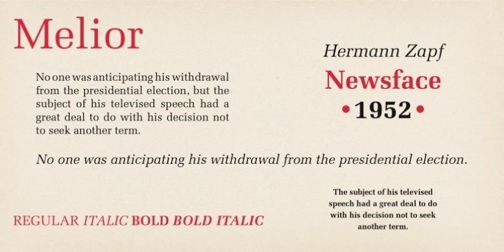
Melior was designed by Hermann Zapf and published by Adobe. Melior contains 4 styles and family package options.
Designer Hermann Zapf set out to create a typeface that was ideally suited to newspapers and other legibility applications. Melior is that typeface, released by the Stempel foundry in 1952.
Its straightforward but elegant design incorporates strong square serifs and condensed proportions based on the superellipse.
Melior is excellent for newsletters and business applications, such as correspondence and annual reports.
Font Family:
· Melior Roman
· Melior Italic
· Melior Bold
· Melior Bold Italic
File Size: 19.59 MB
Tags: 1950s, 1990s, book text, business, business text,
conservative,
corporate,
legible,
magazine, memos,
modern, news, news headline, news text,
serif,
square,
squarish, super-ellipse, tech pubs, text
Release date: December 2, 2007
You can use this font for:
- Design projects: create images or vector artwork, including logos
- Website publishing: create a Web Project to add any font from our service to your website
- PDFs: embed fonts in PDFs for viewing and printing
- Video and broadcast: use fonts to create in-house or commercial video content and more
- The fonts are designed to work on MacOS (Apple) and Windows (Microsoft)
Preview:

