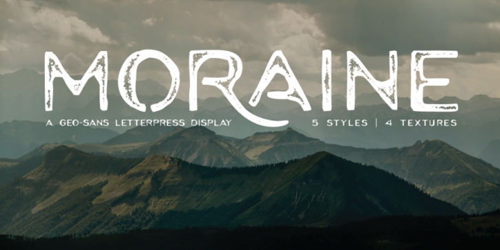

Inspired by the Pacific Northwest, Moraine is a geo-sans display crafted with two things in mind - legibility and texture. Imperfect outlines give Moraine a hand drawn feel, but the geometric letterforms retain legibility at smaller sizes.
Moraine is peppered with various textures to give the user options for look and feel. One font may have a wood type or letterpress feel, while the next my have a linen or denim personality. Opentype features include double-letter ligatures for an organic and realistic hand drawn appearance. Moraine is a small caps typeface, and both upper and lowercase have alternates.
With a long list of language support, Moraine is a great legible display family perfect for pairing with a script or a rustic logo. I like to describe the family as a ‘legible vintage geo-sans.’
Font Family: