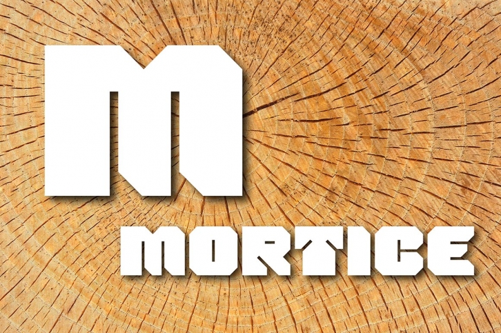

I set out to create a solid, bold, strong & rugged font, one that would lend itself to any industrial type of use, and by that I mean industry in general, but probably sectors that would still be considered male preserves such as carpentry. I thought specifically of mortice & tenon joints, whilst toying with shape and form for this self imposed challenge. I was also visualizing a router tool used for producing most wood joints nowadays.
I think the general premiss worked out well; in the end I settled on the name Mortice, referring to the slots or negative spaces that the matching part, or tenon would fit into.
Mortice comes in OpenType OTF & TrueType TTF formats. Webfont available from the ArtyType website: https://arty-type.com/product/mortice/
