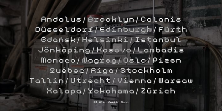

The use of the design for this font is for Display, and while it is issued one regular weight, in the future will develop multiple masters and other experiments.
The design concept of the MT Bleu Feelin Mono Regular font is to take a 45 degree diagonal and geometric cut technique. also every corner is rounded which gives a dynamic impression like electronic music.
I created this font design because I like visual experiments, and applied it to the character of the font.
By using monospaced font characters have an even width. This is a unique feature in that most fonts are 'proportionally' spaced with characters varying in width.
While monospace is perfect in certain ways, it is a proportional font that reigns supreme. Proportional fonts are faster to read. however, the MT Bleu Feelin Mono Regular font is intended for display fonts.
MT Bleu Feelin Mono Regular supports language settings
- Western Europe
- Central Europe
- Southeastern Europe
- South American
- Oceania
- Esperanto
File Size: 19.82 MB
