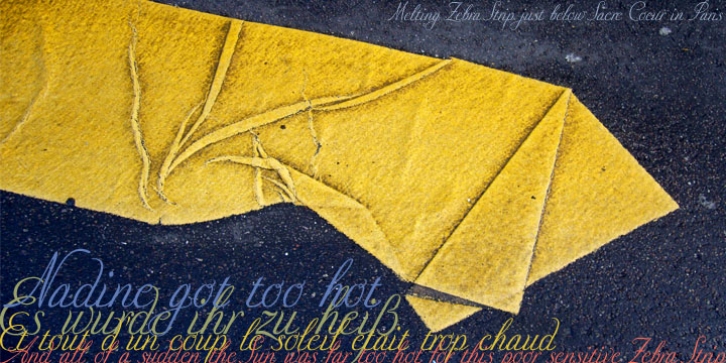

Naudin is in my opinion one of the most underestimated designers of that time. Cassandre and Jackno were his colleagues at D&P but were more interested in promoting themselves. Naudin was not designing fonts that were in fashion in those days, preferring to do his own thing.
Since he only drew one set of initials I had to do the rest. I designed three versions to be used together.
First, a Normal version with capitals that are not so elaborate and open lowercase letters; it is very useful for longer copy.
Second, an Extra version whose capitals stick pretty much to the originals - but with slightly narrower and different lowercase letters, as well as Medieval ciphers.
Third, a StartEnd version that gives you very elaborate capitals to start a text and lowercase end-letters to finish a paragraph with.
Must read!
Only the Normal Script can be used on its own.
The Extra should absolutely be mixed with the Normal cut to get more variation.
The StartEnd cut can not be used on its own, the letters won't fit together.
All three cuts should always be used together.
So I figured, I only sell them together but for a fair price.
Your fair and elegant typedesigner, Gert Wiescher
Font Family:
· Nadine Script Normal
· Nadine Script Extra
· Nadine Script Start End
File Size: 4.57 MB
