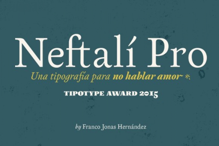

2015 First Prize TipoType award. Neftali is a type family designed for continuous reading in long texts & editorial design, created as an interpretation of Pablo Neruda’s “Poema 20â€. This work delivers a subtle experimentation of Baroque and Roman styles, rescuing features from some of the most successful chilean typefaces such as “Australisâ€, “Berenjena†and “Bibliotecaâ€, along with with its particular calligraphic details, medium weights, accentuated strokes, and wide curves that seek to project Pablo Neruda’s particular way of reciting.
This typeface contains: uppercase, lowercase, small caps, oldstyle and tabular numbers; in addition to a true italic for every weight, and calligraphic details designed to compose his poems. A typography to talk about everything, except love…
(Special thanks to: Francisco Gálvez & Patricio Truenos; without the help of the latter, this project wouldn’t have had an ending)
