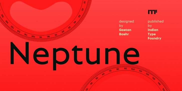

Neptune is a large family of geometric sans serif fonts. Its designer Gaetan Baehr has created 12 styles: six different weights, ranging from Extralight to Extrabold. Each has an upright and an oblique font on offer. Letters in all of Neptune’s weights are drawn with virtually mono-linear strokes. Its lowercase letters have a tall x-height, but still leave enough room for the fonts’ diacritical marks. These are actually quite large; they’ll always be noticed, even in small sizes. Neptune’s ‘a’ and ‘g’ both have single-storey forms. The dots on the ‘i’, ‘j’, and diacritics are round, as are the punctuation marks, too. Despite being a geometric sans, Neptune features letters that break away somewhat from what previous fonts in that style have offered. The Q’s tail has been simplified into a short, vertical stroke. The strokes on both the ‘S’ and the ‘s’ terminate in vertical cuts, instead of having horizontal or diagonal terminals. The lowercase ‘k’ and ‘t’ each have traits that come from our alphabet’s handwritten origins. These details give text set in Neptune a different feeling from other geometric sans serifs. Neptune is an excellent choice for both corporate design and editorial design projects, both because of its range of weights as well as its legibility in text.
Font Family: