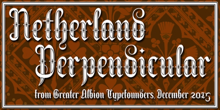
Netherland Perpendicular was designed by Paul Lloyd and published by Greater Albion Typefounders. Netherland Perpendicular contains 5 styles and family package options.
Netherland Perpendicular, a family of five typefaces, is Greater Albion's end of year Blackletter release for 2015. It is designed in the fine traditions of Victorian Revival Blackletter, where historical veracity is ever sacrificed to aesthetic calm. The five typefaces share uniform metrics, making for charming colour overlay effects.
Font Family:·
Netherland Perpendicular Light·
Netherland Perpendicular Regular·
Netherland Perpendicular Demi Bold·
Netherland Perpendicular Bold·
Netherland Perpendicular BlackFile Size: 17.33 MB
Tags: black, black letter, boisterous,
decorative,
display,
elegant,
energetic,
fraktur,
fun,
funny,
glyphic,
lively,
ribbon,
shaded,
victorianRelease date: December 16, 2015
You can use this font for:
- Design projects: create images or vector artwork, including logos
- Website publishing: create a Web Project to add any font from our service to your website
- PDFs: embed fonts in PDFs for viewing and printing
- Video and broadcast: use fonts to create in-house or commercial video content and more
- The fonts are designed to work on MacOS (Apple) and Windows (Microsoft)
Preview:

