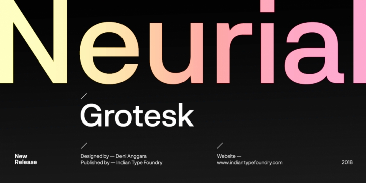

Neurial Grotesk is a family of sans serif fonts designed in the neo-grotesk style. As a typeface, Neurial Grotesk was developed to offer maximum flexibility. The proportions of its letterforms are balanced; these are paired with carefully-crafted diacritics. Neurial Grotesk’s appearance was inspired by twentieth-century modernism and the International Style. However, it is also a heavily constructed typeface, with regularized widths, a minimum amount of stroke modulation, and little optical correction, either. The Neurial Grotesk family includes ten weights, ranging from Light through Bold with matching italics. The fonts feature a tall x-height. The lowercase diacritics are positioned so that most of their tops reach just up to the top of the cap-height. Ascenders rise above this slightly, but the numerals all have the same height as the uppercase letters. Lines of text in Neurial Grotesk can be set tightly and compact. The uppercase includes no descending elements – both the ‘J’ and ‘Q’ keep all of their strokes between the baseline and the cap-height. Each Neurial Grotesk font includes two different forms of the lowercase ‘a’ – one with a tail, the other without. Neat extras include Roman numerals, arrow glyphs, and a few geometric shapes, too. Neurial Grotesk is an excellent selection for use in branding and corporate design.
Font Family: