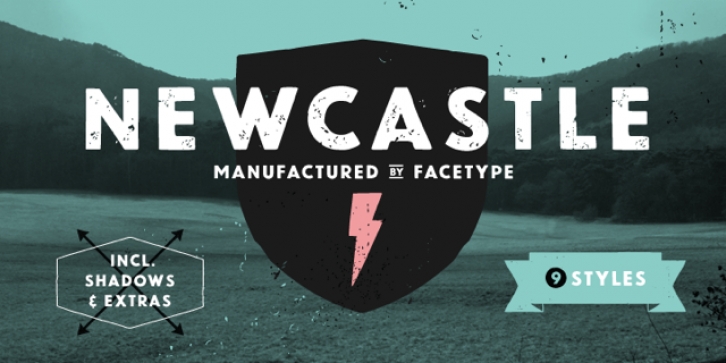

Newcastle gives you great opportunities for spicy typography. If you find some similarities to one of our fonts, Blitzplakat, you are right. We took it to the next level and made it even better: We extended the range of letters, added optional catchwords, extra shapes, shadows, dust and arrows.
To get the most out of Newcastle, use Discretionary Ligatures in the OpenType section of your layout program of choice to turn frequent short words like and, of or from into catchwords. Choose Styleformat 01 to make them vertical. Keep Contextual Alternates activated to make consecutive letters look more realistic (the second letter will be replaced automatically by a slightly different looking version).
Want to roughen the look of your design even more? Add the dust hidden in the Extras style by typing underscore, emdash, endash or hyphen.
This font is vintage fun - let’s party!
Newcastle has been designed by Marcus Sterz.
