
The Backstory Scoop
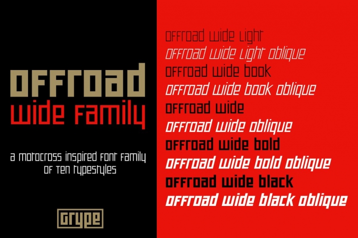
Geometric typefaces can harken back and visually tie themselves to so many genres, from constructivist posters, to techno club flyers, to raw industrial era power. The Offroad family finds its origin of inspiration in the O’Neal MX logo for their motocross division. The Offroad Wide family, a sub-family of the larger collection represented, opens up the stance of the original branding logotype, increasing legibility and taking on a more robotic building block vibe to it, all while offering a wider range of weights and obliques.
The Complete Offroad Collection can be seen and purchased here: https://creativemarket.com/GRYPE/931278-Offroad-Collection
The Offroad Wide Family tackles that original & unique pseudo-unicase style and yet takes on a wide width in five weights (Light, Book, Regular, Bold, & Black) with oblique styling. It carries the same presence as the original logotype inspiration, expands it to include a full and expansive glyphset, and opens an exciting weight and wider width for versatility of use.
Here's what's included with the Offroad Wide Family bundle:
Here's why the Offroad Wide Family is for you:
Share your work with me by sending me a message through Creative Market. We are currently working on our website and would love to feature designers work on our site and via social media when ready. Plus, we love to see our fonts get used in both traditional and unexpected ways!
