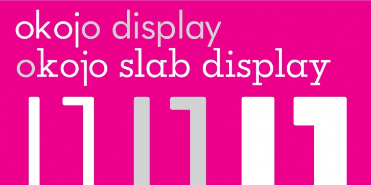

Okojo Display and Okojo Slab Display are geometric sans and slab serif typefaces influenced by the type designs of Paul Renner and Herb Lubalin. The sans serif version has a European sensibility while the slab serif has more of a homespun American feel. Both work well on-screen as webfonts and in print as book type. Each is hinted with accuracy and kerned with precision.
The lighter weights are slightly slimmer than the regular and bold weights to give the typeface more of a vertical feel, inviting readers' to rapidly read typeset text with a maximum of contrast and a minimum of optical dazzle. The entire family was given rigorous testing using Craig Mod’s Bibliotype html-based book layout system for on-screen rendering checks and innumerable print proofs using actual text (not Greek) in InDesign.
12 fonts for $80! Includes all 12 weights of Okojo Display and Okojo Slab Display - Okojo Display Light, Okojo Display Light Italic, Okojo Display, Okojo Display Italic, Okojo Display Bold, Okojo Display Bold Italic, Okojo Display Slab Light, Okojo Display Slab Light Italic, Okojo Display Slab, Okojo Display Slab Italic, Okojo Display Slab Bold, and Okojo Display Slab Bold Italic.
