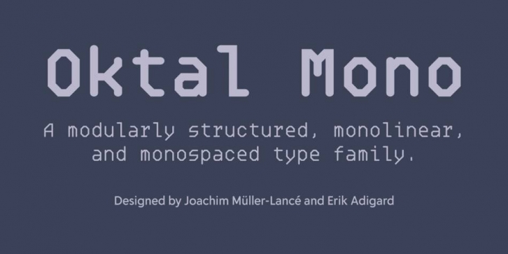

A monospaced type family composed of entirely monolinear and modular structure, Oktal Mono first began in a design-philosophical discourse between Joachim Müller-Lancé and Erik Adigard of the design studio M-A-D in Sausalito, California. The typeface later came to life as a design experiment wherein a type designer (Joachim) and a graphic designer (Erik) collaborate each in their own capacity, from within their respective disciplines.
Erik had proposed the idea of a typeface that would be intentionally generic but with no curves whatsoever by breaking expected curves into facets. Joachim concerned himself with examining systematically what happens when a circle is reduced or translated to a square, hexagon, or octagon, and which of these treatments appear the “least alien†to the original design: A condition that might even depend on the relation of type size to line width—smaller sizes requiring fewer facets so they don’t look merely like crumpled curves.
First, Joachim determined an octagonal base was most appropriate for the average text size. Then the required glyphs were built systematically on a square grid like a construction toy, yielding large numbers of variations. Lastly, in lively discussion as always, character shapes were selected for best fit together in rhythm and consistent aesthetic.
Oktal’s concept is an interesting exploration in various design aspects. How far can you get by following simple, strict rules? When and where do you need to compromise, how far and in what manner? For adding detail in complex characters such as currencies, it was necessary to break the grid into smaller units, and for small shapes like fractions, to introduce slightly thinner strokes. Yet all of it could be achieved while never straying from 45° diagonals. Thus, the rhythm of letterforms becomes more intricate at times, but never changes tempo.
Font Family: