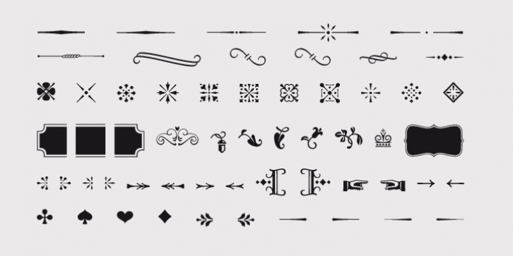
Opal was designed by Hannes von Döhren and published by Linotype. Opal contains 8 styles and family package options.
Opal Pro is a text family designed by Hannes von Döhren in 2008. It gives every text a noble character. The typeface has long ascenders that clearly rise above the capital letters and a low x-height. Opal's letters sport inktraps at stroke junctions, which on one hand create a cutout feeling and on the other hand strengthens the image in larger point sizes. In total, the letterforms have clear emphasis on their verticals and horizontals; they do not fear the weight on their curves. In addition to the Italic and Bold, the Opal type family includes a Script face, whose letterforms include connections, similar to handwriting. On top of that, the typeface possesses swash letters for italic and script, small caps, many ligatures and borders & ornaments.
With a little bit of care, designers will be able to create the finest of traditional, elegant work with this family.
Font Family:
· Opal Pro Regular
· Opal Pro Italic
· Opal Pro Bold
· Opal Pro Script
· Opal Std Regular
· Opal Std Italic
· Opal Std Bold
· Opal Std Script
File Size: 9.56 MB
Tags: baskerville,
book, book text, business text,
conservative,
elegant,
english,
engraving,
feminine,
formal,
french,
garalde,
garamond,
humanist, italics,
jannon,
legible, ligatures,
noble,
old-style,
oldstyle, ornaments,
poetry,
prismatic,
renaissance,
roman,
serif,
swash,
transitional,
valuable,
venetian, x-height
Release date: March 18, 2012
You can use this font for:
- Design projects: create images or vector artwork, including logos
- Website publishing: create a Web Project to add any font from our service to your website
- PDFs: embed fonts in PDFs for viewing and printing
- Video and broadcast: use fonts to create in-house or commercial video content and more
- The fonts are designed to work on MacOS (Apple) and Windows (Microsoft)
Preview:

