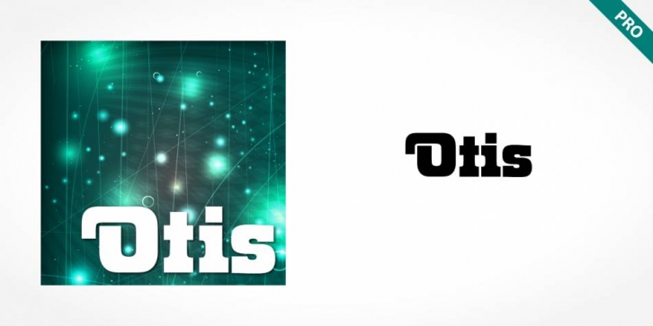

The extravagant Otis Pro figures a display of constructed basic forms and when set into words, the typeface builds closely set lines. The strong serifs catch the reader’s eye and draws it horizontally across the page. The forms of the capital letters are particularly distinctive. In the upper third, the stroke beginnings seem to form a roof over the body of the letter, fragmented by a fine white line that lends them independence and dominance.
Otis Pro is best used for headlines in display point sizes.
1970s, 70s, Ads, Advertisement, Advertisements, anno 1970, Announcements, bold, Catalogs, Catalogues, Cool, Decorative, Dynamic, Frosty, Headline, Male, masculine, old-fashioned, Poster, Race, Retro, Screen, Serif, Slab Serif, Speed, Speedy, Squared, Std, Stencil, strong
Font Family: