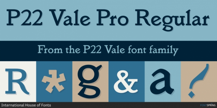

The Vale Press was a contemporary of Willam Morris’s Kelmscott Press. The types used by the Vale Press were designed by artist Charles Ricketts, who also supervised the design and printing of Vale Press books. The main type used, Vale, was based on the Jenson 15th century roman type style.
The King’s Fount was an experimental semi-uncial font based on the Vale type. The King’s Fount was designed in 1903 for the Vale edition of the 15h century poem “The Kingis Quairâ€. This semi-uncial font evokes old English and Anglo-Saxon lettering.
P22 Vale Pro combines the two fonts P22 Vale Roman and P22 Vale King’s Fount into one “Pro†font. This pro font also includes a Central European character set, old style figures, fractions, ornaments and a special faux “Middle English†feature to make “anee text appeer Olde.†This feature is not known to exist in any other font.
