P22 Zebra
Karlgeorg Hoefer (1914–2000) was a highly accomplished calligrapher, type designer, and educator in the lettering arts. His typefaces have been released by the notable German foundries Ludwig & Mayer, Klingspor, Stempel, and Linotype.
Hoefer spent much of his professional life in the typographically rich city of Offenbach, near Frankfurt. The city’s other typographic luminaries include Peter Behrens and Rudolf Koch. Much of Hoefer’s work can be found in the Klingspor Museum there.
The type designs of Karlgeorg Hoefer range from his first type, Salto (1952), its 1950s flair derived from his broad-nibbed pen style of writing, to one of his last designs, Sho, which came forty years later. Sho is a script formed from bold brush strokes which, in isolation, almost defy the glyphs they are intended to define. Hoefer has also created blackletter and other script faces as well as the 1970s-era “FE-Schrift (short for fälschungserschwerende Schrift, or falsification-hindering script) conceived for German license plates. This design employs anti-counterfeiting techniques and, after years of development (and time spent lost in the archives of the transportation ministry), debuted in 2001 on new German plates.
Hoefer’s gift for type design is but one facet of his lettering artistry. His calligraphic style has influenced a number of contemporary lettering artists, including Richmond, Virginia’s Michael Clark. “Hoefer was, and remains, the king of brush lettering in Germany. Nobody even came close,†Clark says. One piece done by Hoefer, a journal cover for the Calligraphic Society of Los Angeles, featured a striking blackletter done with a pointed brush. His most famous blackletters are the typefaces Notre Dame and San Marco.
In the early 1990s, lettering master Julian Waters taught with Hoefer at his open calligraphy workshop in Offenbach, Schreibwerkstatt Klingspor. Waters says that Hoefer’s typefaces carry his characteristic brush writing style. Several of Hoefer’s designs, including Salto and Big Band, have been digitized and issued by various foundries. One previously undigitized design, however, was Zebra.
Zebra (1965) is probably Hoefer’s most unusual metal typeface. This experiment with a brush face was designed as a partly black and partly grey gouache drawing. The optical effect of this typeface was completely new for a script face. The technical problem remained: how could the grey be produced for metal type? The punchcutters of D. Stempel AG found a solution. Master punchcutter August Rosenberg had recently retired from Stempel; however, his influence and expertise no doubt carried over to the craftsmen who cut Zebra. The areas that would be grey were made into fine parallel lines (hence the reason for naming the font Zebra).
A simulated shades-of-grey effect had been accomplished previously with the Bifur font from the Piegnot foundry of Paris in 1929. But Hoefer’s face was not geometric like Bifur and required a bit more subtlety. Trial proofs show a few different approaches to the shading with crosshatching, resulting in an almost half-toned effect. The final form used an even pattern of parallel lines at a 45° angle to play off of the slant of the script face angle.
The new P22/IHOF release presents six separate fonts based on the original painted drawings and Stempel proofs. The solid version proofs showed a full stencil version, along with a solid version of the two-shade effect. A third hybridized version was the final released typeface. One additional variation that was not released by Stempel took its cues from the two-part metal Bifur fonts and Hoefer’s original two-color artwork. P22 Zebra A and B can be set in two separate colors and overlaid to achieve the original effect. Zebra A and C can be overlaid in a single color to look the same as Zebra Striped, or two colors can be used for more unusual effects. Zebra A, B, and C can be combined in curious ways, but it’s not recommended without proper safety precautions in place.
For more information on the life and work of Hoefer, visit •••
This website was created by the senior Hoefer’s son, Otmar, who works with Linotype GmbH in Germany. The site offers a wonderful overview of the many facets of Hoefer and examples of his lettering art. Additional information can be found at ••• and •••
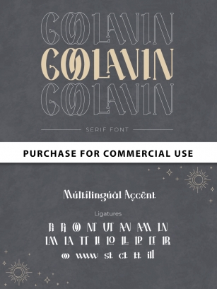
Designed by Karlgeorg Hoefer.
Digital version of Zebra designed by Colin Kahn.
File Size: 9.43 MB
Release date: January 16, 2012
You can use this font for:
- Design projects: create images or vector artwork, including logos
- Website publishing: create a Web Project to add any font from our service to your website
- PDFs: embed fonts in PDFs for viewing and printing
- Video and broadcast: use fonts to create in-house or commercial video content and more
- The fonts are designed to work on MacOS (Apple) and Windows (Microsoft)