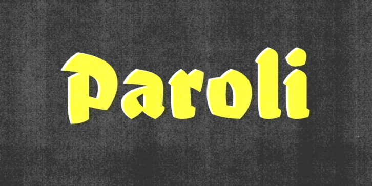

Designed by Elena Schneider, Paroli is the “ludic counterpart of Eskorte,†a serif she developed at Reading University. Paroli became a relative playground, allowing Schneider to maintain her strictness with Eskorte.
It’s deceptively simple in its appearance. But as someone who has tried their hand at designing the sort of characters that would feel at home in one of Lucian Bernhard’s plakatstil designs, I respect Schneider for creating a typeface that feels so authentic in how it honors its references, but isn’t larded down with pastiche.
While rooted in the distinct marks of a brush, Paroli’s sharp edges and efficiently pared-down forms have hand-drawn origins, allowing them to hit a point of minimalism just before their character would start to disappear. The flares and partial joins of the strokes are well placed, helping to manage the wonderful formal eccentricities of blackletter rendered with such weight. But that “brushy temper†gives Paroli a friendly swell and a lively rhythm that counter the often bellicose nature of blackletter forms.
It’s natural to see Paroli as limited because of its visual parentage, but I think it’s well worth keeping in mind for any big, bold typesetting situation where just a few words are doing all of the heavy lifting and a unique character is called for.
(by Chris Rugen for Typographica’s “Our Favorite Typefaces of 2014”)
