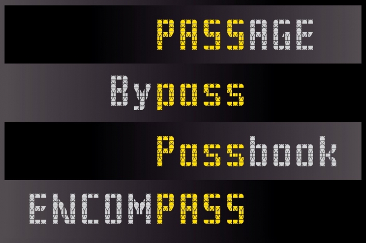

The typefaces, Pass-T and Pass-U, are based on the matrix systems found on the Tram and the U-Bahn in Berlin. Unusually for a matrix design the letterforms are derived from pre-existing type style. Information displays tend to privilege functionality and efficiency and so letterforms become governed by those criteria. While such approaches can result in novel shapes and ideas, all too often they produce poorly designed letterforms and problematic spacing. In that regard it is always encouraging to encounter designs that have found solutions that perform equally as well but that are informed by typographic ideas and practices. The over- and underground travel systems of Berlin are great examples of such an approach. While different, both cleverly fold in a knowledge and appreciation of typography. The key influence appears to be taken from the condensed geometric sans of the early 20th Century(1). This is particularly clear in the lowercase which shares many features with modularly constructed type of that period. For example: single storey ‘a’ and ‘g’; diagonal strokes, such as the leg of the ‘k’, are constructed vertically; and a ‘t’ with a cross stroke only to the right of the stem. Moreover, the lack of serifs and an adherence to grid structures means little ‘information’ is lost or ‘corrupted’ when the transferring the type to these new, much more limited conditions. Most matrixes are built from a repetition of one binary unit on both the vertical and horizontal axis. Such a uniform grid makes nuanced details difficult, as one can see with many dot-matrix displays(2). The tram and U-Bahn matrix take a different approach. Both are composed of a single column whose height is divided into a number of sections. Each of these individual sections, while always the same width, are sized and divided according to the typographic details associated with that position (how terminals end, the weight of strokes etc.). Such an approach has enabled the designers to compress a lot of glyphic detail into a limited space. In that sense they share more features of early Liquid Crystal Displays than with dot-matrix displays. However, where LCD designs where mathematically proportioned the columns of the tram and U-Bahn account for difference. Indeed, as part of the development process it seems as if all required characters were overlaid, in order that their common features may be analysed. Such an approach would reveal shared or common features of each individual glyph and its most recognisable features. As such it requires a knowledge and appreciation of typography and the time necessary to pursue and develop any findings. This is most apparent in the bottom section of each column. Here the rectangular form is divided asymmetrically in recognition of the stroke direction of descenders. To be sure, a symmetrical design could have been employed but the character set did not necessitate it. This attention to the details of a particular context is revealing. Finally, each single column is repeated to construct the overall matrix, producing a sophisticated system for communicating travel destinations. While it may seem trivial, or lacking in the big schema of economic, social, and political struggles it demonstrates how design can transform the world. How combining a ‘care for’ and a ‘knowledge of’ can greatly enhance our experience, understanding and appreciation of our world. It provides a platform in which a care for the visual and its impact on our environment and social well-being helps produce a common. For it has the potential to create a public who defend it when it is attacked or threatened. But, more importantly, it is an approach that can have powerful affects that lend themselves to be emulated, copied and distributed. When we are part of a caring and thoughtful environment we are likely to become caring and thoughtful also.
Further details to follow...
(1) For example see Tschichold’s ‘block-script’ of 1930. This design could be seen as a synthesises of the earlier ‘constructivist’ designs of the period. It should be noted that Tschichold’s design was not fixated on a strict adherence to the grid, and contained a certain flex on the vertical axis, as noted by Christopher Burke.
(2) There are, as one would hope, exceptions such as the elegant Intimo by Gareth Hagues (Alias). I have also been working with students on a dot-matrix workshop that seeks to critique through investigation the authority of functionalist aesthetics.
Bibliography Burke, C. (2007) Active literature: Jan Tschichold and New Typography. Hyphen Press, London.
