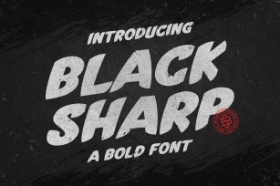
Das Grotesk on the other hand is a lively design with several distinguishable characteristics which attract attention when set at large sizes, whilst they become subtle and blend evenly at small sizes, fostering a neutral identity. This is a very legible and space-saving typeface with a narrow structure. It was designed with slanted curved ends and sheared terminals applied on several straight strokes. It has two-storey 'a' and 'g' but includes single-storey alternates.
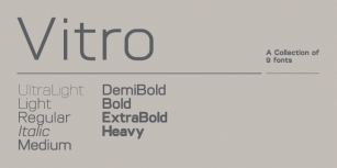
The family consists of 14 weights ranging from Extra Thin to Black (including true-italics). It provides simultaneous support for Latin, Cyrillic and Greek and is loaded with several advanced typographic features such as small caps.
Download its complehensive PDF Specimen Manual for further details.
Font Family:
· PF Das Grotesk Pro ExtraThin
· PF Das Grotesk Pro ExtraThin Italic
· PF Das Grotesk Pro Thin
· PF Das Grotesk Pro Thin Italic
· PF Das Grotesk Pro Light
· PF Das Grotesk Pro Light Italic
· PF Das Grotesk Pro
· PF Das Grotesk Pro Italic
· PF Das Grotesk Pro Medium
· PF Das Grotesk Pro Medium Italic
· PF Das Grotesk Pro Bold
· PF Das Grotesk Pro Bold Italic
· PF Das Grotesk Pro Black
· PF Das Grotesk Pro Black Italic
File Size: 19.6 MB