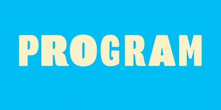
Program is a type designer’s typeface. It is about the craft of typeface design and the particular details and effects that type designers fret over when they design type. It mixes different structures, stem endings, and weight distributions not usually employed in a single family of fonts. It features both rounded edges evoking the effects of reproduction, and ink traps, the technique used to counteract that effect. The idea was to create a series of fonts with strong individualistic features, challenging the constraints of a central theme that is usually imposed on a family of fonts, while still relating to each other in terms of overall look and feel.
Program has four weights, while Program Narrow has three. Instead of matching the overall “color†in text settings between the Program and Program Narrow versions, as is often done, the stem weights were matched. This allows for a more comfortable matching of stem weights when combining the two versions at larger sizes on posters or in headlines.
Structurally, the Program type family would be difficult to classify as it mixes different structural models. Program Book, for instance, with its low contrast, has the features of a Neo-Grotesque with slight Humanist tendencies that are most visible in the calligraphic, brush-like tail endings of the lowercase a, d, b, k, u, and capital R and K. Program Narrow is decidedly more Modern in structure, with pronounced vertical stress carried throughout all characters.
Program and Program Narrow diverge most notably in the design of the a, c, e and s in both lowercase and capitals. In Program, the terminals of these curved characters are vertical. This opens up the counter spaces and increases legibility, contributing to its fitness as a text font. In Program Narrow the terminals are horizontal. Bending the curves into themselves like this accentuates the verticality of Program Narrow. The effect also creates more compact letter shapes making it a suitable headline font.
——-
Download the PDF here
Emigre Fonts is a digital type foundry and publisher of type specimens and artist books based in Berkeley, California. From 1984 until 2005 Emigre published the legendary Emigre magazine, a quarterly publication devoted to visual communication. The Emigre font library features more than 600 original typefaces, including Mrs Eaves, Brothers, Matrix and Filosofia.
Supported languages: German, Spanish, Dutch, English, Polish, Russian, French, Czech, Swedish, Portuguese, Catalan, Italian, Slovenian, Maltese, Arabic, Devanagari, Greek, Gujarati, Gurmukhi, Hebrew, Chinese (hk), Japanese, Korean, Tamil, Chinese (Traditional), Chinese (Simplified), Turkish, Hungarian, Vietnamese, Bengali, Kannada, Cherokee, Thai, Armenian, Belarusian, Danish, Macedonian, Ukrainian, Norwegian, Serbian, Telugu, Malayalam, IPA, Latvian, Chinese Pinyin, Finnish, Filipino, Malay, Croatian, Kazakh, Romanian, Persian, Indonesian, Slovak, Hindi
File Size: 21.3 MB
Release date: June 22, 2016
You can use this font for:
- Design projects: create images or vector artwork, including logos
- Website publishing: create a Web Project to add any font from our service to your website
- PDFs: embed fonts in PDFs for viewing and printing
- Video and broadcast: use fonts to create in-house or commercial video content and more
- The fonts are designed to work on MacOS (Apple) and Windows (Microsoft)


