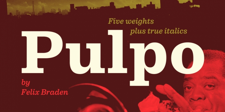

Pulpo is a friendly and comfortable looking Clarendon with the skeleton of Century Schoolbook. Longer extenders give text a bit more air to breathe and improve legibility in small text sizes. Despite the strength and sturdiness of the design, each letter shape carries warmth and an echo of the human hand. The familiarity of the letterforms also conceals some nostalgia.
The family has 10 styles, ranging from Light to Black (including italics) and is ideally suited for editorial, advertising and packaging as well as web and app design. A massive body combined with low stroke contrast, emphasizing the horizontal elements, make it very suitable on screen and for small text sizes on newsprint paper. Each cut includes 489 glyphs with four sets of numerals and extended language support to meet the needs of today’s communication.
For more information visit the microsite: http://floodfonts.com/pulpo
Font Family: