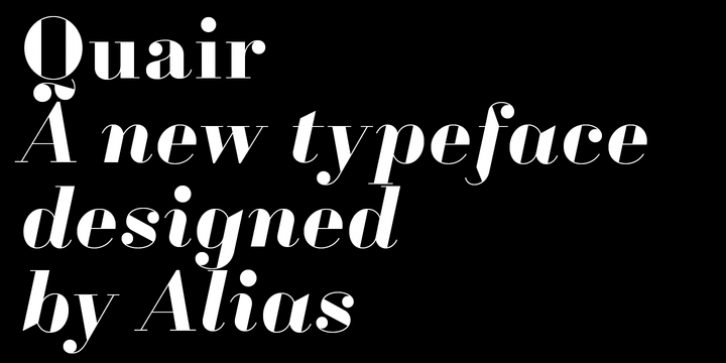

Quair mixes typographic and graphic reference points, most notably from market-stall trader lettering and from Thorowgood and Scotch nineteenth-century typefaces. Quair isn't an updating or redrawing of these. It adds different ideas to make a distinctive, separate-looking typeface.
The lettering by Market stall traders to advertise their products has immediacy and economy, but is expressive and surprising. Letter shapes that look drawn but have a feeling of being written in quite a simple, unfussy way. Shapes are big, decorative but unrefined, Quair's lettershapes have this idea of being reduced. They are minimal, in that they lack subtlety, but are characterful and individual. Round and Triangle serif options highlight this idea of the letters as graphic shapes, and offer a difference in emphasis between curvy and angular.
Like Oban, Quair takes inspiration from the Thorowgood, nineteenth century headline typefaces. These have striking and idiosyncratic drawing, with exuberent, bold letter shapes. As with the market trader lettering their character and individuality is expressed through an economy of drawing, and the impact of the high contrast between thick and thin.
Quair's character shapes have something of the sparse, rigorous quality of Scotch typefaces. Scotch typefaces are known for their utility aesthetic. Quair has something of this, but typographic nuance has been reduced with a simplified, graphic shape. Modulation has been replaced with binary thick/thin. An angular, basic and inelegant look, but functional and useable.
Font Family:
· Quair Round Regular
· Quair Round Italic
· Quair Round Bold
· Quair Round Bold Italic
· Quair Triangle Regular
· Quair Triangle Italic
· Quair Triangle Bold
· Quair Triangle Bold Italic
· Quair Round Headline Regular
· Quair Round Headline Italic
· Quair Round Headline Bold
· Quair Round Headline Bold Italic
· Quair Triangle Headline Regular
· Quair Triangle Headline Italic
· Quair Triangle Headline Bold
· Quair Triangle Headline Bold Italic
File Size: 11.29 MB
