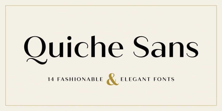

Quiche Sans is a high-contrast, sans serif typeface with monoline stroke endings, angled stems, and geometric proportions. A sibling to the Quiche family, with the ball terminal endings removed. With weights ranging from thin to black and matching italics, there are a variety of applications that the fonts can be used for: print, web, branding, advertising, magazines, products, packaging, labels, etc.
The design is influenced by the serif didone genre, characterized by its elegance and extreme thick/thins, but it removes the serifs for a unique and modern expression and tapers out the stroke endings for a sophisticated monoline appearance.
Quiche Sans has many OpenType features, including:
• Multiple stylistic alternates
• Swash capitals
• Ligatures
• Fractions, subscripts, and superscripts
This font has extensive Latin language support for Western, Central, and South Eastern European.
Font Family: