Ratio Modern was designed by F. Kleukens, Patrick Griffin, Kevin King and published by Canada Type. Ratio Modern contains 5 styles and family package options.
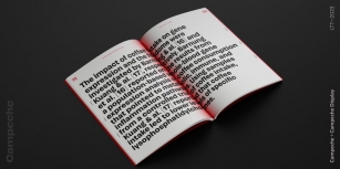
Designed in 1923 by Friedrich Kleukens for the Stempel foundry, Ratio was one of the first metal faces to bring the Didone genre to the forefront of industrial mass publishing as a headline and magazine face. Though essentially modern in construct, Ratio incorporates some old-style and transitional traits, managing to summarize the European evolution of this particular aesthetic. This is evident in its shaped serifs, soft roundings, an elegantly subdued italic, the variation of its shapes between weights, and the obvious fat face influence in the ExtraBold. Thus Ratio finds the balance between modern elegance and fine typographic tradition.
This exclusive digitization expands on the original metal set by including small capitals and many alternates in all the styles. It also boasts a larger than usual linguistic support.
Font Family:
· Ratio Modern
· Ratio Modern Italic
· Ratio Modern Medium
· Ratio Modern Small Caps
· Ratio Modern ExtraBold
File Size: 18.82 MB
Tags: 1920s,
advertising, ball terminals,
chic,
classic,
contemporary, cosmetics,
didone,
elegant,
european,
exotic,
fashion,
fashionable, fat face,
finance,
formal,
german,
glamour,
graceful,
high-contrast,
invitation,
jewelry,
magazine,
modern,
poster,
refined,
rmr-classic, rmr-serif-business,
romantic,
sensible,
serif,
shopping, small caps,
stylish,
upscale,
valuable,
vogue,
weddingRelease date: May 25, 2011
You can use this font for:
- Design projects: create images or vector artwork, including logos
- Website publishing: create a Web Project to add any font from our service to your website
- PDFs: embed fonts in PDFs for viewing and printing
- Video and broadcast: use fonts to create in-house or commercial video content and more
- The fonts are designed to work on MacOS (Apple) and Windows (Microsoft)
Preview: