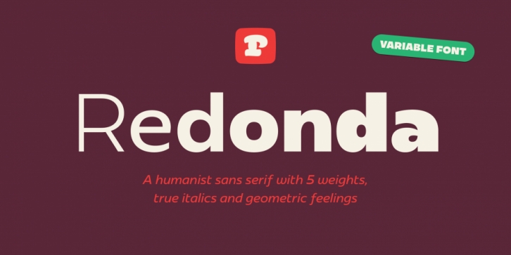

Redonda is Carlos Mignot, aka Cacá’s first retail release. It started as a brand new custom typeface for our studio (hey, we have to practice what we preach!). All caps, super heavy and geometric. Slowly but surely it evolved into a complete family and a lot has changed since. It moved from geo-sans to humanist, with true calligraphic italics that lend a soft vibe to any layout.
There’s one thing that always bother art directors in non-English speaking countries: how to fix the tight linespacing headlines when you have so many accents/diacritics bumping into each other? Our answer to that are the already beloved short diacritics, even connecting to their main components. This makes tight headlines a breeze.
You can adapt its personality in many ways. From alternate shapes to variable fonts, Redonda is a great addition to branding projects, website headlines, advertising, social media communication and more.
Redonda has been popping up and down in Brazil and now it wants to take on new frontiers. What will you design with it?
Font Family: