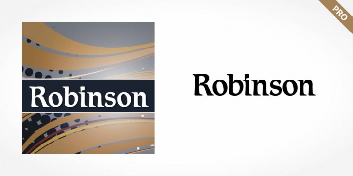

Robinson Pro: The character of the strokes, as well as the serif forms, give the font its calligraphic look. The placement of the serifs, on the upper left and lower right of a character, also distinguishes this typeface and allows the figures to be set very close to one another. The dots on the i and j do not hang in the air, rather, they are connected to the rest of the letter with a light, serif-like stroke. The elegant and lively Robinson Pro font is legible even in smaller point sizes. It is best used in middle-length texts and headlines and wherever an individual and sophisticated image is the goal.
Font Family: