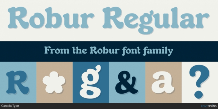

It shouldn’t be a surprise to anyone that these letter shapes are familiar. They have the unmistakable color and weight of Cooper Black, Oswald Cooper’s most famous typeface from 1921. What should be a surprise is that these letters are actually from George Auriol’s Robur Noir (or Robur Black), published in France circa 1909 by the Peignot foundry as a bolder, solid counterpart to its popular Auriol typeface (1901). This face precedes Cooper Black by a dozen of years and a whole Great War.
Cooper Black has always been a bit of a strange typographical apparition to anyone who tried to explain its original purpose, instant popularity in the 1920s, and major revival in the late 1960s. BB&S and Oswald Cooper PR aside, it is quite evident that the majority of Cooper Black’s forms did not evolve from Cooper Old Style, as its originators claimed. And the claim that it collected various Art Nouveau elements is of course too ambiguous to be questioned. But when compared with Robur Noir, the “elements” in question can hardly be debated.
The chronology of this “machine age” ad face in metal is amusing and stands as somewhat of a general index of post-Great War global industrial competition:
- 1901: Peignot releases Auriol, based on the handwriting of George Auriol (the “quintessential Art Nouveau designer,” according to Steven Heller and Louise Fili), and it becomes very popular.
- 1909-1912: Peignot releases the Robur family of faces. The eight styles released are Robur Noir and its italic, a condensed version called Robur Noir Allong
